Category Focus
Cotton Candy
A light, color-driven category direction where packaging atmosphere is often as important as the product itself.
What This Category Should Deliver
The line has to do more than just look interesting.
The highlights below are written to help buyers understand where the category has real commercial value.
Category Strengths
- Cotton CandyThis category relies heavily on presentation, color harmony, and display mood.
- Cotton CandyStrong fit for seasonal, carnival, or party-led concepts that need a softer visual language.
- Cotton CandyBest approached as a coordinated product-plus-packaging project.
Retail Fit
- ApplicationParty packs, themed gift boxes, and playful retail events.
- ApplicationSeasonal displays where soft colors and upbeat tone matter.
- ApplicationPrivate-label concepts that need a lighter, more whimsical front end.
Visual References
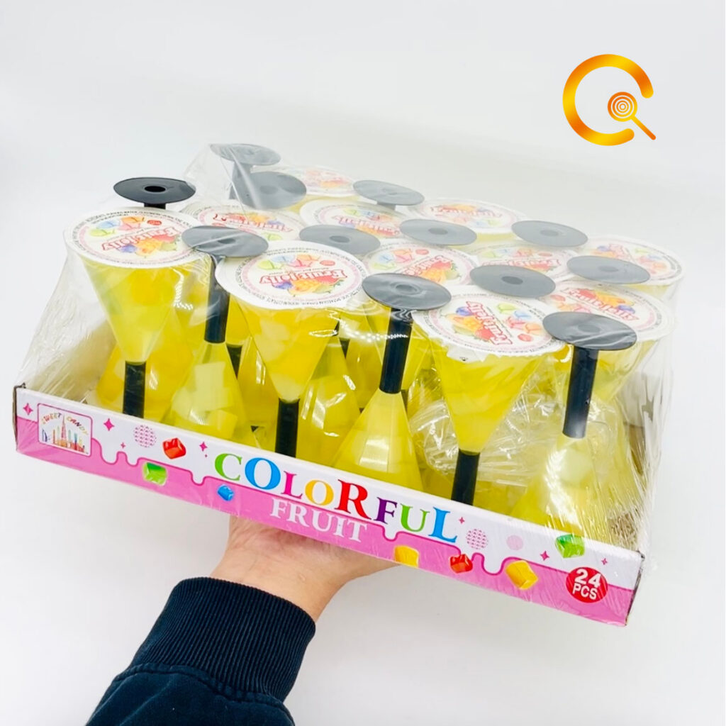
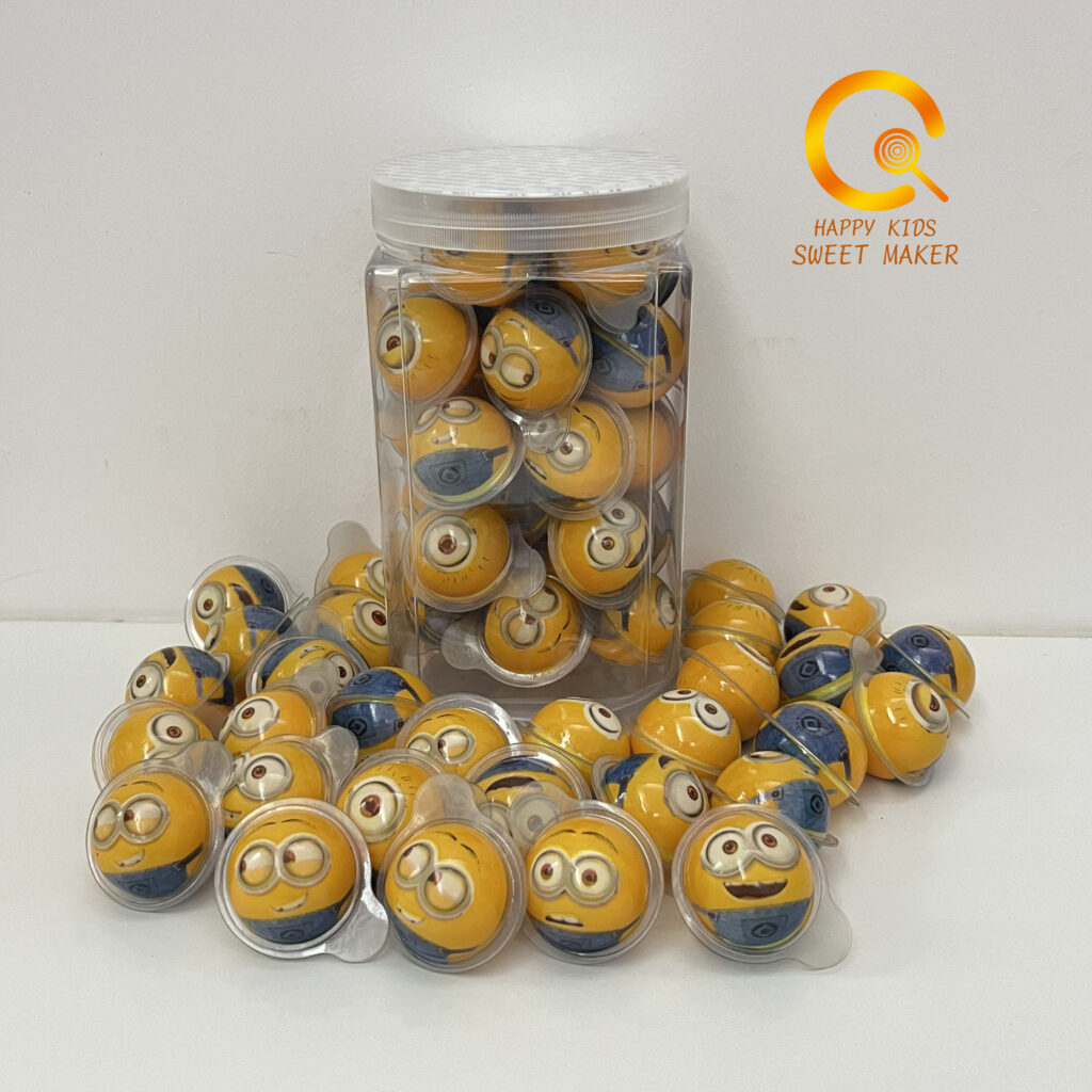
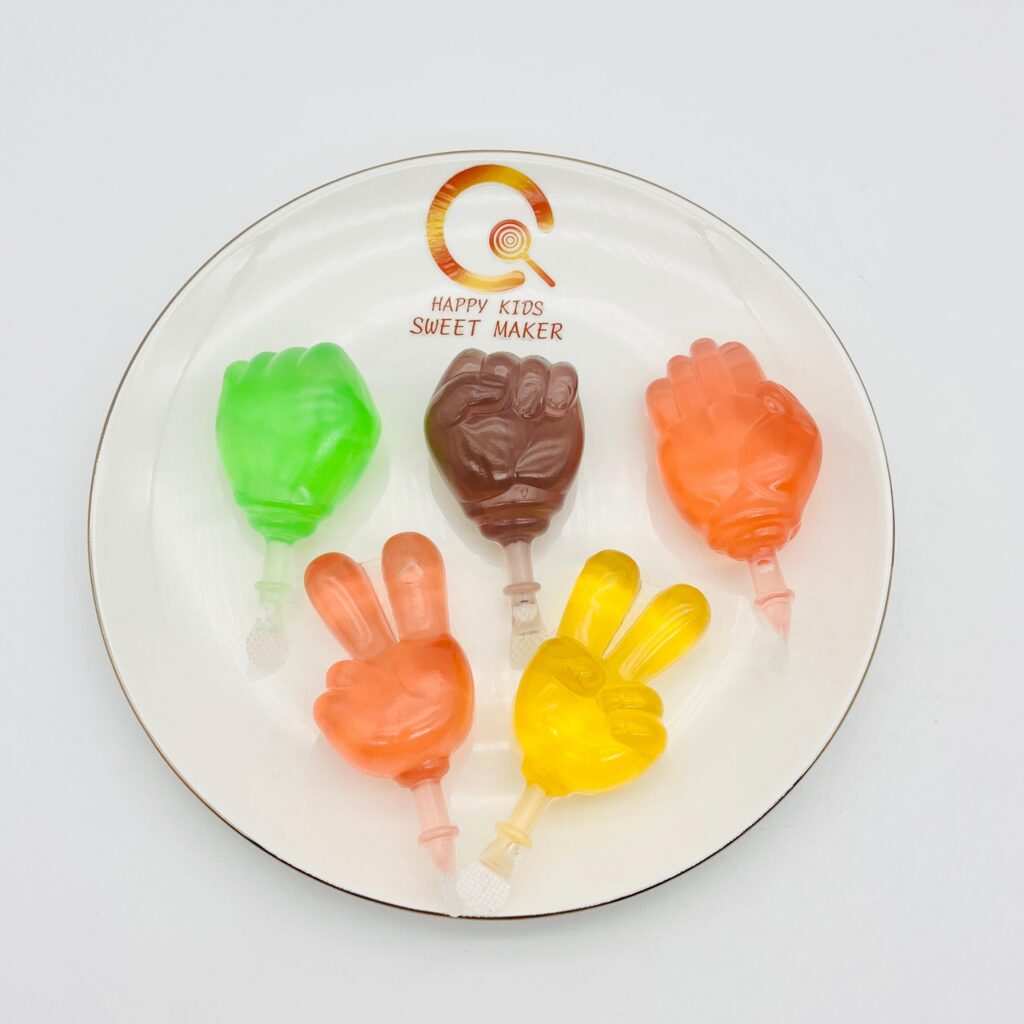
Representative media for the category discussion.
These uploaded images are used as portfolio material so buyers can read the mood, display logic, and pack language more quickly.
What Buyers Usually Brief Us On
Three clear inputs are enough to move forward.
- Brief pointTarget mood, color family, and seasonal window.
- Brief pointPreferred display pack, individual unit size, and assortment mix.
- Brief pointWhether the line should feel premium, cute, or pure fun.
Project Direction
For cotton-candy style programs, the atmosphere matters early.
Buyers move faster when they can define the display mood and the type of consumer moment they want the product to serve. That gives the product line a clearer identity from the start.
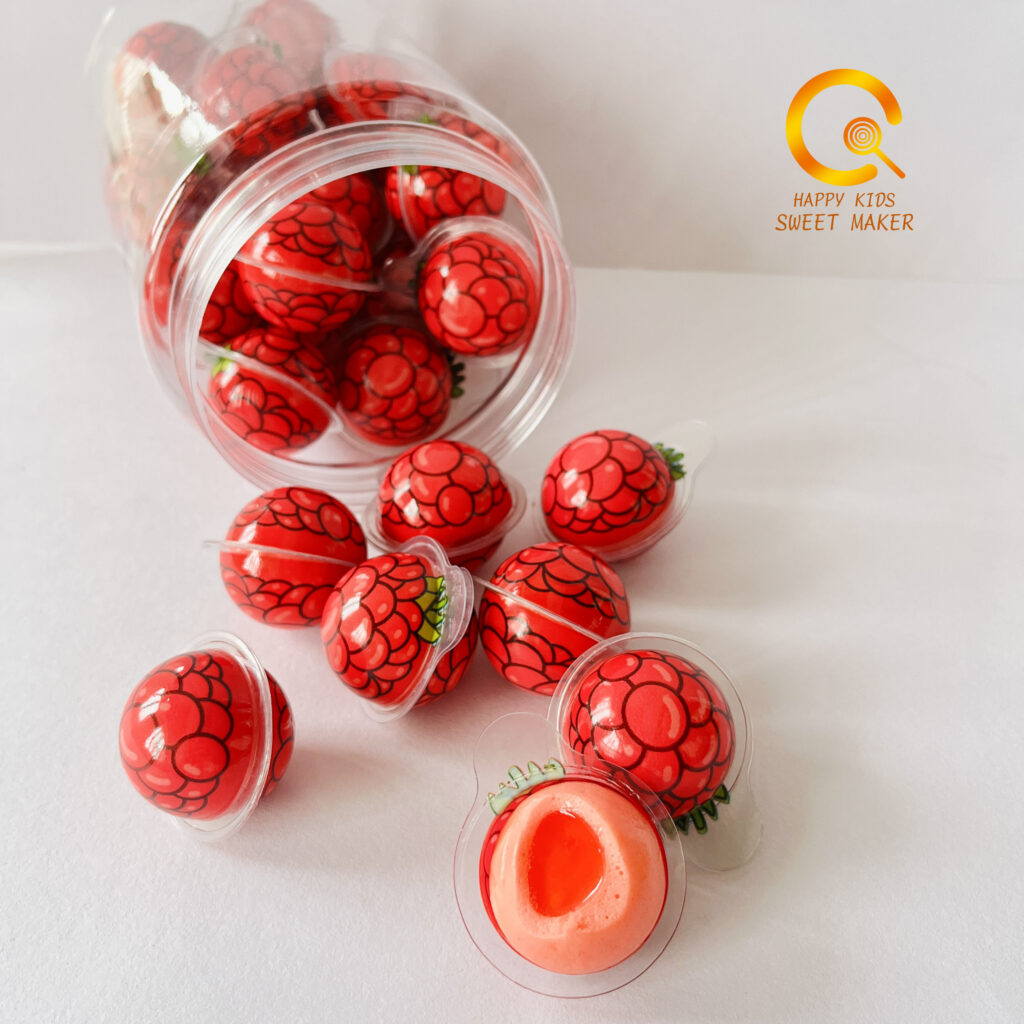
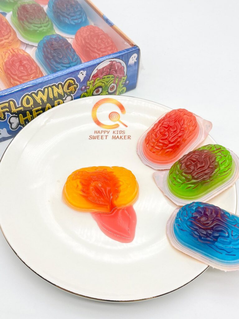
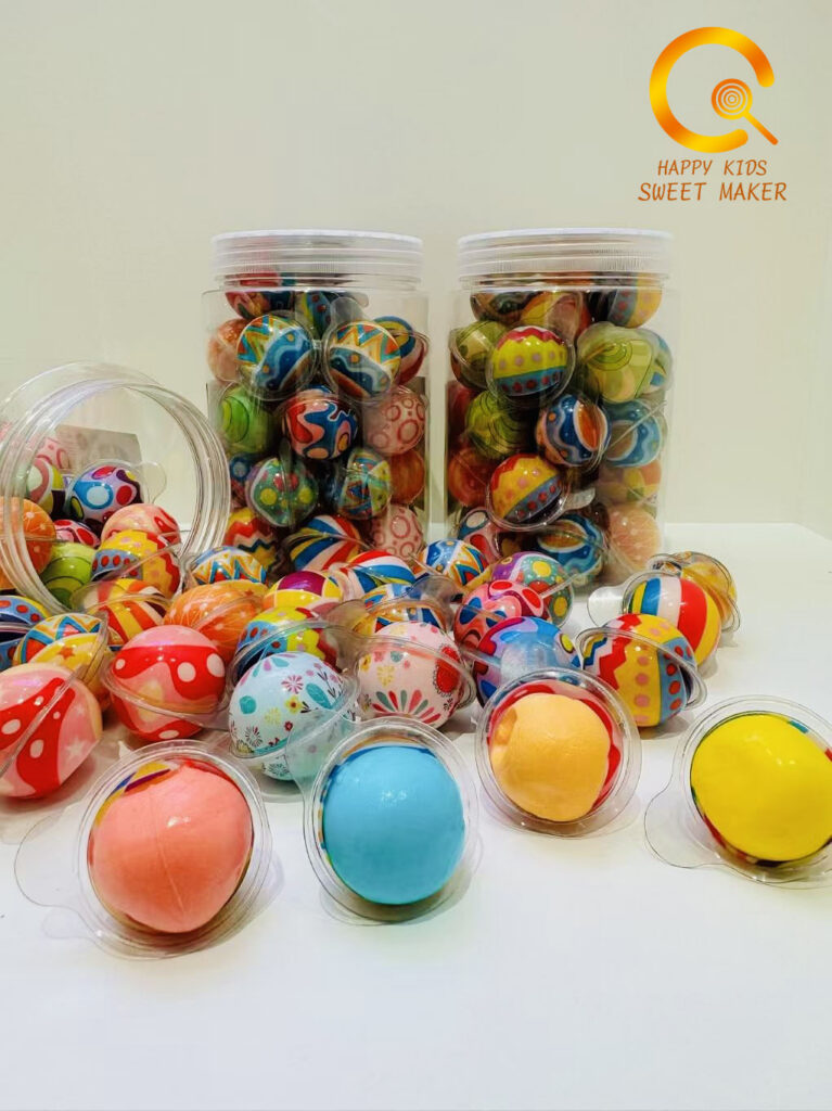
Colour-led concept references
Bright fruit-forward images are being used here as range mood references to guide the softer, more playful visual direction of the category.